Tandem
Tandem makes cycling kit for people who ride in the city, in the rain, in traffic. The brand needed to work at 30 kph from 30 metres — high-visibility as an aesthetic, not an apology.
Client
Tandem Cycling Co.
Role
Brand designer
Services
Identity · Kit graphics · Launch site
Year
2024
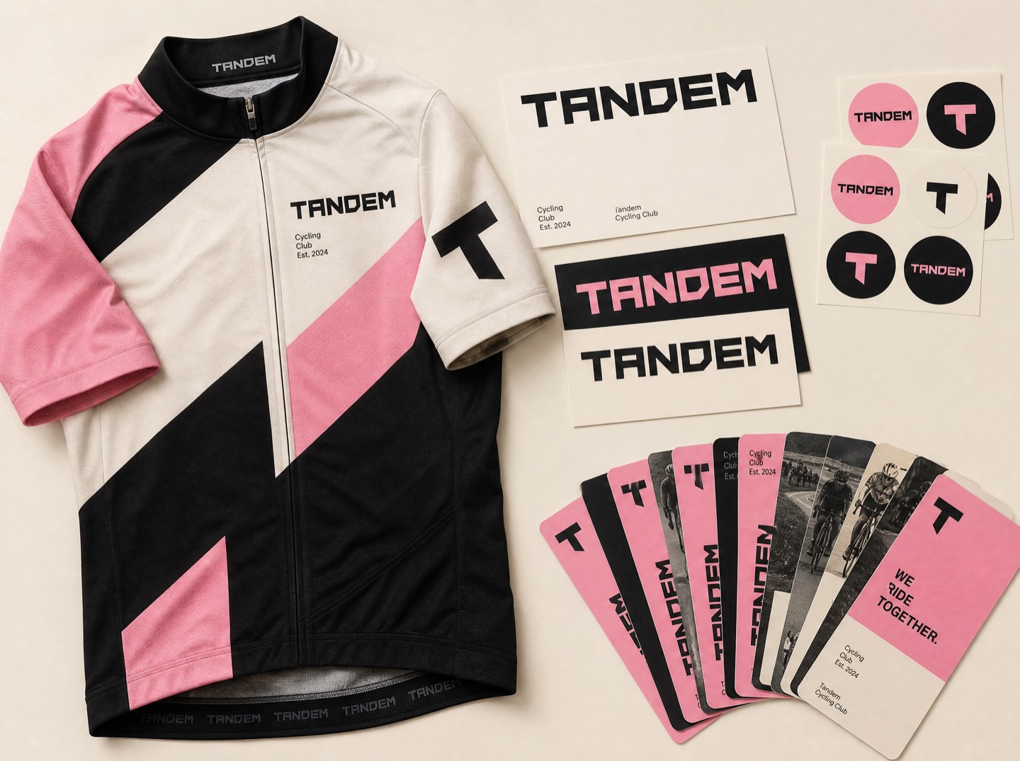
Cycling brands split into two camps: euro-heritage serif nostalgia, or tech-bro aero minimalism. Tandem rides to work. Their kit gets rained on, locked up, and worn into meetings. The identity had to survive all three.
Legible at speed
The wordmark is built from a single ultra-wide cut — five letters that read from across an intersection. Kit graphics use blocks of the pink against ink panels, placed where drivers actually look: shoulders, back pockets, ankle cuffs. High-visibility stopped being a compliance feature and became the whole point of view.
The system in the wild
- Three lockups — full, stacked, and a spoke-card badge — all readable in motion.
- A pattern language cut from chevrons and lane markings, never decoration for its own sake.
- A launch site that sells the philosophy first and the jersey second, with a fit guide written by actual commuters.
People stop us at lights to ask about the kit. That's the marketing budget now.Rae Lindqvist — Founder, Tandem
The first production run sold out in nine days, and the spoke-card badge — meant as ephemera — became the brand's most requested sticker. Loud works.
Want results like these?
Start a project