TailwindCSS gives us the ability to create some really cool designs. It also gives us the power to create some cool elements on our page, such as browser mockups. You'll learn how to create multiple browser mockups in this quick tutorial in TailwindCSS.
Creating the Browser Header
We'll create the header by adding a rectangle with rounded top corners:
<div class="w-full h-11 rounded-t-lg border-2 border-black"></div>
Next, inside our rectangle, we need three rounded dots positioned to the left. We could easily create a small dot with the following HTML:
<span class="w-3 h-3 rounded-full bg-black"></span>
We can now put three dots inside our rectangle and position them to the left with flex justify-start items-center. Finally, we need some padding and spacing for our dots space-x-1.5 px-3. This will give us our final browser mockup header below.
<div class="w-full h-11 rounded-t-lg border-2 border-black flex justify-start items-center space-x-1.5 px-3">
    <span class="w-3 h-3 rounded-full bg-black"></span>
    <span class="w-3 h-3 rounded-full bg-black"></span>
    <span class="w-3 h-3 rounded-full bg-black"></span>
</div>
Create The Mockup Body and Container
Now, we need to add the body of our browser. That's simple enough, below our header we can add a simple rectangle:
<div class="border-2 border-black border-t-0 w-full h-96"></div>
Notice: we remove the border-top from the body to prevent a thicker line separating the header and the body.
Finally, we want to wrap our mockup inside a container with a max-width. This will result in our final browser mockup:
<div class="max-w-2xl mx-auto my-10">
    <div class="w-full h-11 rounded-t-lg border-2 border-black flex justify-start items-center space-x-1.5 px-3">
        <span class="w-3 h-3 rounded-full bg-black"></span>
        <span class="w-3 h-3 rounded-full bg-black"></span>
        <span class="w-3 h-3 rounded-full bg-black"></span>
    </div>
    <div class="border-2 border-black border-t-0 w-full h-96"></div>
</div>
And, that's all there is to it! Of course, we can create different variations of browser mockups by changing the colors.
Creating a Gray Mockup
Using the same classes as above we can modify some of the colors to create a simple gray browser mockup. Here is an example of this mockup:
<div class="max-w-2xl mx-auto my-10">
    <div class="w-full h-11 rounded-t-lg bg-gray-200 flex justify-start items-center space-x-1.5 px-3">
        <span class="w-3 h-3 rounded-full bg-red-400"></span>
        <span class="w-3 h-3 rounded-full bg-yellow-400"></span>
        <span class="w-3 h-3 rounded-full bg-green-400"></span>
    </div>
    <div class="bg-gray-100 border-t-0 w-full h-96"></div>
</div>
Creating a Dark Mockup
Utilizing the same color techniques as above we can inverse the colors to create a sleek looking dark browser mockup like so:
<div class="max-w-2xl mx-auto my-10">
    <div class="w-full h-11 rounded-t-lg bg-gray-900 flex justify-start items-center space-x-1.5 px-3">
        <span class="w-3 h-3 rounded-full bg-red-400"></span>
        <span class="w-3 h-3 rounded-full bg-yellow-400"></span>
        <span class="w-3 h-3 rounded-full bg-green-400"></span>
    </div>
    <div class="bg-gray-700 border-t-0 w-full h-96"></div>
</div>
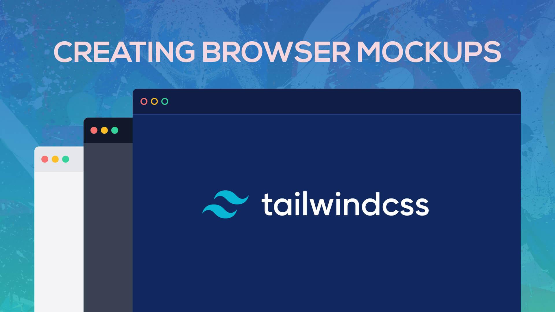
Create a Dark Blue Mockup
You may have also seen the code mockups on the TailwindCSS homepage. We can easily recreate this style by changing up a few colors in our mockup. Take a look at the example below.
<div class="max-w-2xl mx-auto my-10">
    <div class="w-full h-11 relative rounded-t-lg bg-blue-900 flex overflow-hidden justify-start items-center space-x-1.5 px-2">
        <div class="absolute w-full h-full inset-0 bg-black opacity-50"></div>
        <span class="relative w-3 h-3 border-2 rounded-full border-red-400"></span>
        <span class="relative w-3 h-3 border-2 rounded-full border-yellow-400"></span>
        <span class="relative w-3 h-3 border-2 rounded-full border-green-400"></span>
    </div>
    <div class="relative bg-blue-600 border-t-0 w-full h-96 border-t border-blue-900">
        <div class="absolute w-full h-full inset-0 bg-black opacity-60"></div>
    </div>
</div>
Now, we have some really sleek looking browser mockups created with some simple utility classes.
Conclusion
Utilizing the TailwindCSS utility classes, we can create some really cool mockups and designs. Be sure to head on over to the TailwindCSS docs to learn more.
If you are interested in a TailwindCSS Drag'n Drop builder, be sure to check out our latest products Tails.